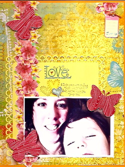
Sometimes, when you're trying to use up scraps, creativity is the key to making it look sensational. I've been struggling with the title and photo mat for some time. I've wanted to use it, but my punch work wasn't the greatest, and if I was to use it, I wanted to hide the flaws in it. I didn't know how to go about doing that.
I sat at my desk for quite some time moving things and rearranging them, when finally a design began to take shape. To hide the punching flaws, I pulled the photo below the punched portion along the bottom of the mat, then used the floral border to anchor my photo (so it didn't look like it was floating out in space). I repeated the butterflies throughout the page, after the blue one inspired me.
See the small bit of flowers on the top right of the layout, with the date tag hanging from it? That's the portion of the flower border I cut off so it didn't hang off the page. As a side note, I looooveee how the red pops off the page. It looks so striking next to the yellow!
Oh--and speaking of hiding flaws, when I stamped the title work, I pressed too hard, and one edge of the stamp marked up my title mat. To hide that, I stamped and fussy cut a couple hearts, and stamped another heart directly to the title mat. A tiny bit of it is still peeking through, but I'm fairly satisfied with hiding the mistakes.
If you make a mistake- though, I should say when- think outside the box. Can you work with it, and make it part of your project? If not, how can you hide it? Play around with things, and see what you come up with!
Supplies:
Stampin' Up: Night of Navy, Pumpkin Pie, and Bravo Burgundy inks; Love Matters stamp set, water color pencils
K&Co: border strip (Brenda Walton Around the World collection), yellow patterned paper (Best of collection)
Martha Stewart: Double loop border punch
Jillibean Soup: red patterned paper and pink date tag (Winter Tortellini collection)
Recollections: orange card stock (Spice Market collection), yellow card stock
Adhesives: 3D- Dots, Glue Dots, Herma Vario tape
Misc: button, embroidery thread
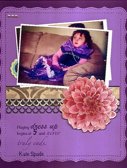
When I sat down at my desk to play tonight, it completely slipped my mind that I had already printed this picture out. I must have done it yesterday, but I don't remember doing it. I have a great memory; its just short LOL
Well...rather than writing it off as a picture to be saved for another time, I decided to use them both at once. Initially, I was going to put them one under the other, but didn't like the repetition of it. So, I stacked them instead. I love this technique, and don't use it often enough, in my humble opinion.
Once again, I wanted to pick up the accents in Addisons' dress, so used this giant flower that was sitting on my desk. (I love it when a plan comes together...) I also wanted to use a border, so raided my border drawer, and pulled out the pretty brown/grey toned patterned paper (which I do believe is Stampin' Up). I thought it was elegant, and conveyed the 'princessy' feeling perfectly (and, it looks stunning against the purple), so obviously had to use it. Then, I found the navy blue patterned paper, and decided to double up on the punched border accents. I used this to mimic the ruffled ribbon in her dress, and once again, the rhinestones mimic the pearly fringe.
To make the title, I went to the computer, and printed off a quote I found on Pinterest, and saved to my Quotables board. If you'd like to see what other quotes I've got there, go here.
Lastly, I've included some hidden journalling on my layout. I didn't want to clutter up an already perfect (in my mind) layout, so slipped the journalling behind the pictures. Basically, it says that even though Addison isn't 5 yet, she still loves dressing up- and that's her favorite dress to wear.
Supplies:
K&Co: giant flower
Stampin' Up: brown patterned paper
Recollections: navy card stock; dark purple and light purple card stocks (Jewel and Cool Water collections, respectively)
Martha Stewart: Cherish border punch
Adhesives: 3D dots, Herma Vario tape
Misc: pearl rhinestones
 RSS Feed