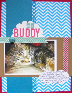
Last weekend Neruda finally got to go home to her mama. I miss her terribly. She was my little shadow for soooo long. She spent 7 months with us- long enough for her to become my own pet. Every time I'm in my haven, and I'm sitting either here at my desk, or at my work table, and I instinctively think that its time to move her when I'm ready to change spots. Then I remember she's not there anymore. *sigh* She's welcome to come back any time she wants to.
This layout is in homage to my little shadow. We really did bond really quickly. No one else in the family particularly liked her, and her feelings were evident for them. But me- she felt different about me. Right from the start, too. She often cuddled in my lap, licked my hands and would often gently nip my fingers, trying to encourage me to pet her some more, and she hung out with me in my scrap room. Every.single.night. Yeah, she was psycho, but she added so much vibrancy to our house- more than what the kids already add. It meant a lot to me that she was so drawn to me.
I love it when 'mistakes' work themselves into projects. The scallop circle on which the title is adhered to, is actually an insert for a card. I cut it with my Cricut, but it wasn't what I wanted for that particular card. Rather than throwing it out, I kept it. And, it finally came in handy! So, when you make a 'mistake' creating something else, don't throw it out! It'll be useful for something, sometime. If you find that you haven't used it, and its 6 months or a year later, then throw it out. (I do that to 'thin out' my stash every so often). To hide the long part of the insert (the bottom portion of what would be the card), I slid it under the photo mat, and used it to house the title. Works beautifully, doesn't it?
Another little trick to keep in mind, is after you've used up accents, but you want to keep replicating the same shape of a particular journalling spot or accent, keep the sheet it came on, and trace the negative space onto a separate sheet of card stock or patterned paper. That's what I did with the journalling spot. It was just the right size, and I have nothing else that even comes close to that shape. (I could use my Cricut, but after the kids are in bed, I'm afraid to use it because I think it makes too much noise; I also don't want to cut it out 20 times just trying to find the right size). This way is a lot quicker!
Supplies:
Recollections: chevron patterned paper, red card stock and kraft (brown) card stock strip
Sandy Lion: red washi tape
Jillibean Soup: Blue patterned paper banner
K&Co: blue brad (Ancestry.com collection)
Carta Bella: title alphas (from the True Friends collection)
Adhesive: herma vario tape
Misc: white card stock and blue punched card stock
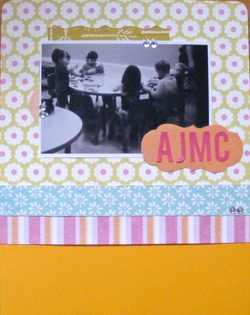
Every so often- though not often enough as far as my kids are concerned- I bring them to the gym with me and let them play at Child Mind while I work out. Its pretty expensive between the two of them, so I use it sparingly (I also find that it just works better to go at night, after Kyle gets home from work). When this picture was taken, the girls were engrossed in playing with play-doh. They didn't even know I was there! I even waited for a while before letting them know I was there. It was so sweet watching them play!
(I get a real kick out of the look the little guy is giving me in the background on the right side of the picture. It cracks me up every time I see this picture!!)
Supplies:
Carta Bella: flowered patterned papers (all from the True Friends collection) and title alphas
Recollections: orange card stock (from the Moroccan collection)
Misc: green patterned paper behind the photo (from K&Co), pink and orange striped patterned paper (Amanda Blu, I think), orange card stock the title is adhered to, clear rhinestones
Adhesive: herma vario tape
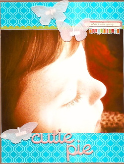
I mentioned a couple of days ago, in a Point to Ponder, to try using panoramic photos on a project. I took my own advice and created one (actually two, but you'll have to wait until tomorrow for the second one!!) The quality is poor, but I just love this picture of Addison. A little tip to remember when choosing your photos, is to try and use ones first that evoke a lot of emotion for you. I try and stick to that tip as closely as possible when I'm crafting. You'll find the journalling and visual memory you created when you're done will exemplify those feelings you've got tremendously. Use all the other ones you want to scrap, but that don't hold as much meaning for you later on. You don't have to toss them or keep them hidden in a box. They can go into albums too, but maybe create a year in review type design or monthly summary to get them scrapped too. Just a few ideas to inspire you!
Also, when the quality of a picture is poor (such as a cell phone pic, or blurry one), its best to keep the pictures small and in black and white, but I wanted this picture to be centre stage, even though its grainy and (truthfully) hideous. Heh. I didn't like any of the filters I tried editing this picture with, except for the vintage one, so that's what I stuck with. Sometimes, you just need to break out of the mold!
There's a story behind the itty bitty sticker at the top of the layout- "When I was young". Addison has this saying lately, "When I was a baby..." She starts off quite a few of her sentences and statements that way, and it just cracks me up. What an incredible, FUNNY child! So, even though the quote isn't exact, I had to include it, because its so darn close to what she actually says. :)
Supplies:
Recollections: blue card stock (lattice collection) and kraft card stock
Carta Bella: title and embellishments (from the Alphabet Junction collection)
K&Co: vellum butterflies
Adhesive: herma vario
 RSS Feed